- Logo Design for Quisine
- Logo Design for Quisine
- Logo Design for Quisine
- Logo Design for Quisine
- Logo Design for Quisine
- Logo Design for Quisine

INTRODUCTION
Quisine is a dynamic food delivery service designed to bring the flavors of world cuisines directly to customers’ doors. From Italian pasta to Japanese sushi, Quisine makes it simple to explore an array of international dishes with just a few taps. Built on principles of diversity, speed, and innovation, Quisine promises a seamless and delightful culinary experience, from the moment an order is placed to its delivery at the doorstep.

BRAND IDENTITY & CONCEPT
The brand name, Quisine, cleverly combines two key ideas: “quick” and “cuisine.” This fusion of words reflects the service’s commitment to offering high-quality, diverse meals from various cultures while prioritizing efficient, swift delivery. The name itself embodies the essence of a modern culinary experience, balancing speed with authenticity and quality.
COLOR PALETTE
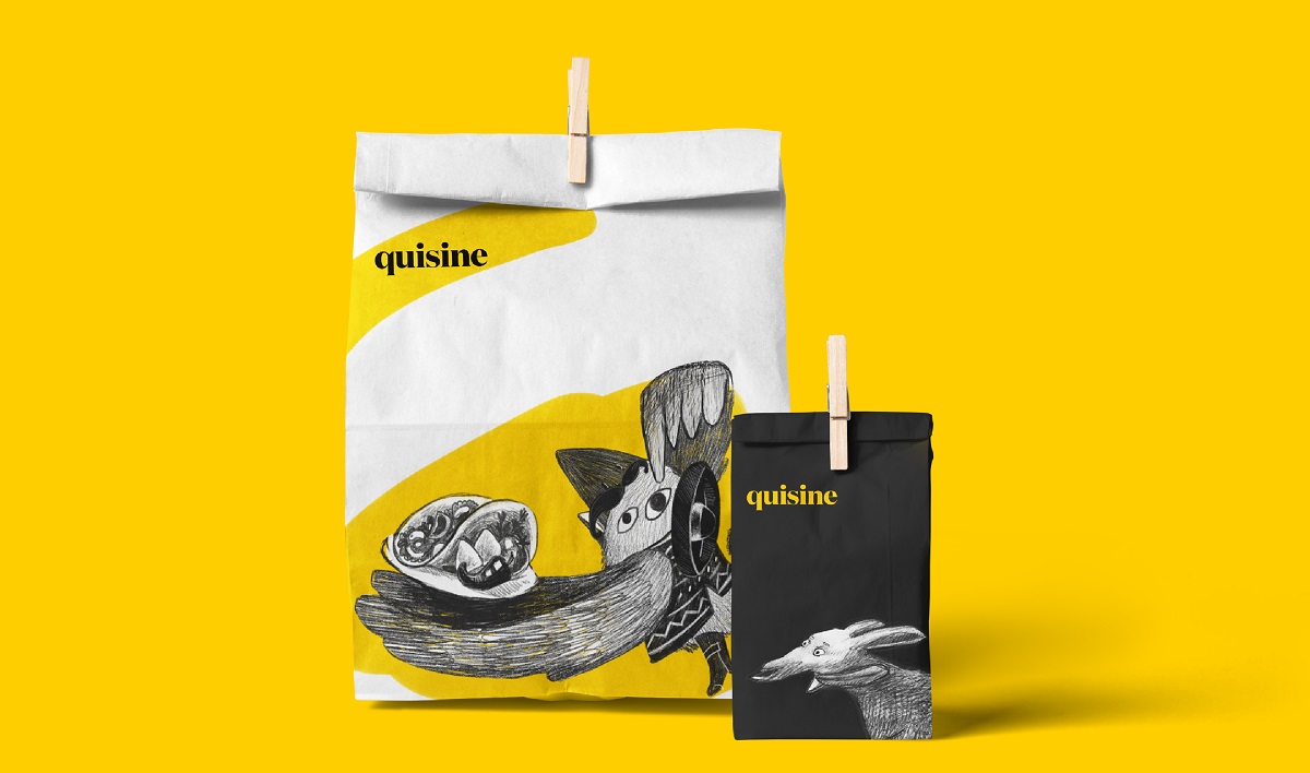
To visually capture Quisine’s brand essence, two contrasting colors—yellow and black—were selected. Yellow brings a sense of warmth, energy, and approachability, evoking the delight and freshness of the meals. Black, on the other hand, conveys sophistication, professionalism, and reliability. This contrast not only creates a visually striking logo but also communicates the dual focus of Quisine: delivering authentic, high-quality meals quickly and reliably.

TYPOGRAPHY
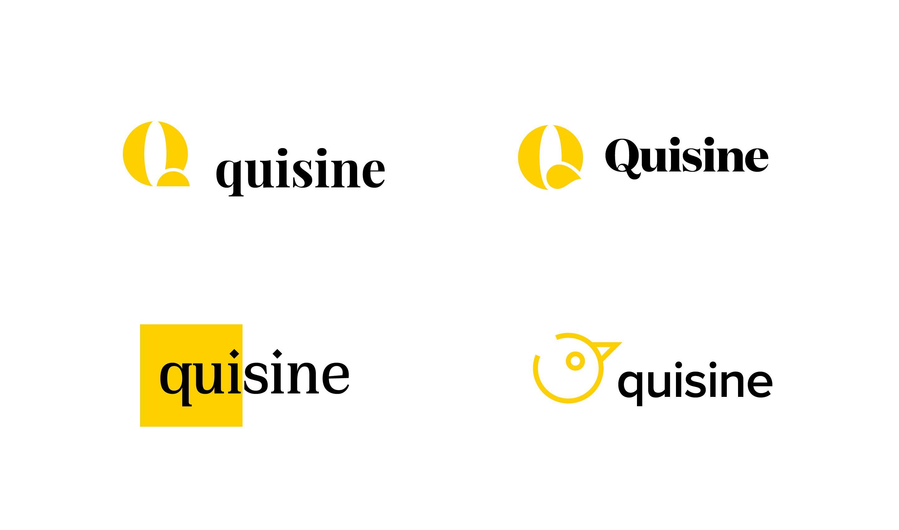
For the logo’s typography, a classic serif font was chosen to add a refined touch. The serif typeface exudes a sense of fine dining and quality, emphasizing that while Quisine is fast, it doesn’t compromise on delivering meals that feel premium and crafted. This choice of font bridges the gap between the speed of fast food and the sophistication of world-class cuisine.
FINAL LOGO
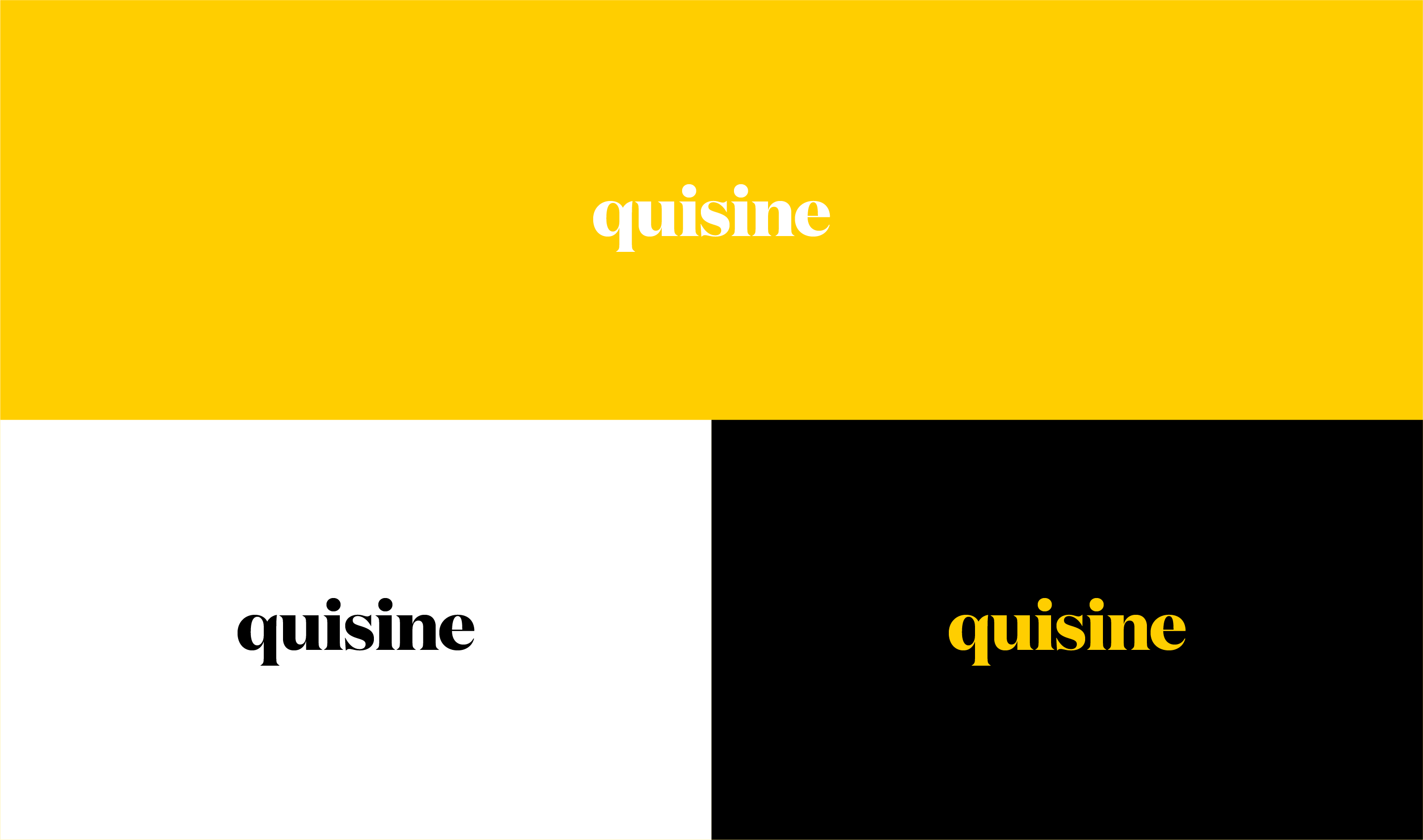
The final logo for Quisine is a harmonious blend of modern convenience and classic quality. The bold contrast of yellow and black catches the eye, while the serif font lends an air of elegance, signaling to customers that Quisine is more than a typical food delivery service—it’s an experience. The logo successfully encapsulates the brand’s dedication to bringing high-quality, international flavors to its customers with speed and style.


